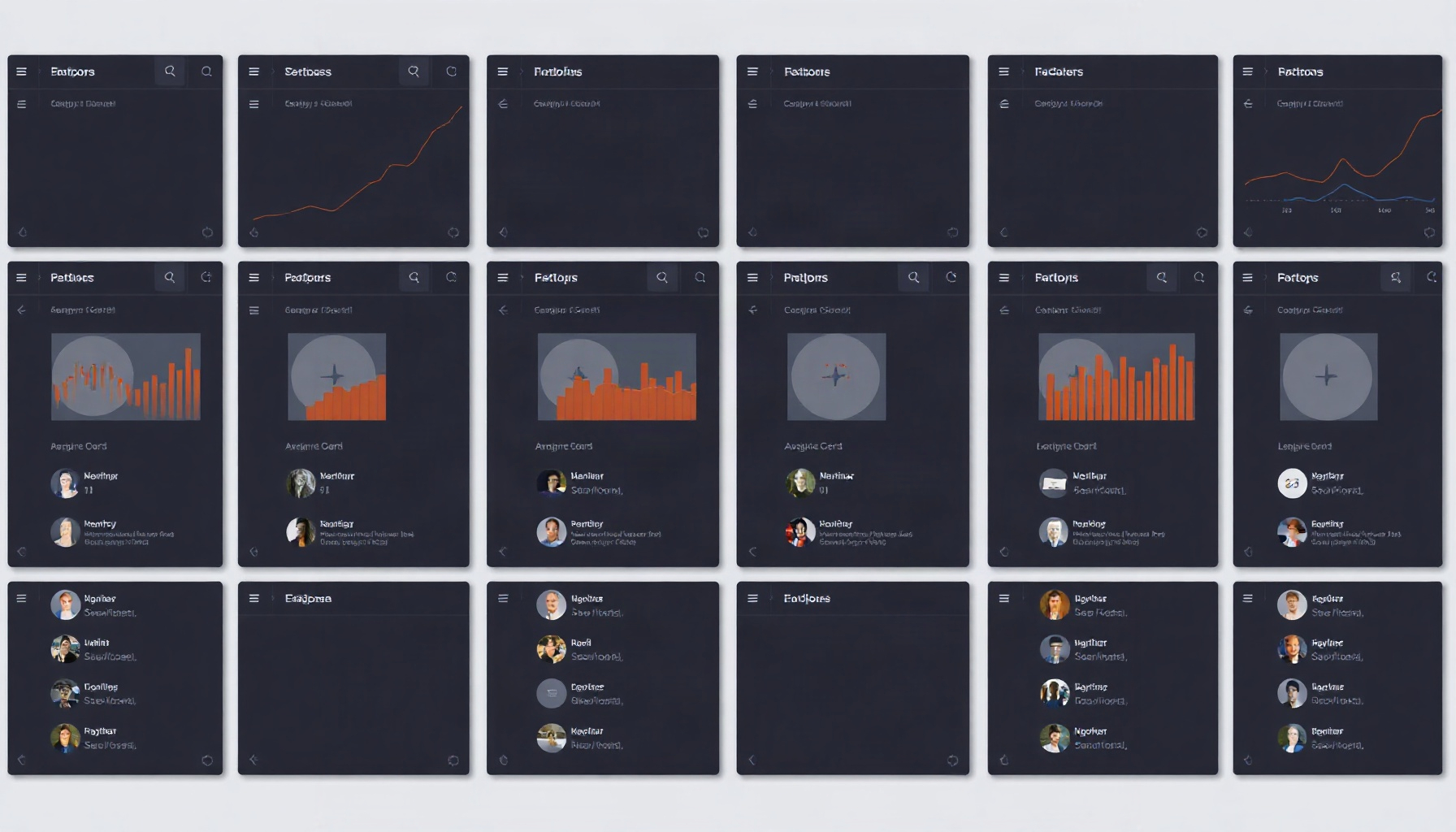
Agents can escape “AI slop” not by having better taste, but by measuring the diversity of their own design output — precision-and-recall, Vendi Score, and entropy over generated UI artifacts turn homogenization into a computable signal an agent can optimize.
What “AI slop” actually is: convergence to the mean
“AI slop” is the visible symptom of a distributional problem: generative systems trained on recursively generated data lose distribution tails first and converge to the mean, as Shumailov et al. showed in Nature in July 2024 (companion preprint: arXiv 2305.17493). Applied to interfaces, that means the modal card grid, the modal hero, the modal nav bar — not because they are best, but because they are typical.
The word “slop” implies laziness. The mechanism is closer to gravity. A model that has learned the center of a distribution will keep returning to the center, and each return makes the center denser. For a design agent, this matters because the agent’s own outputs become the environment it is judged in. If every candidate it generates looks like every other candidate, then a ranking step that picks the “best” one is picking from a set that has already collapsed.
Homogenization is therefore not a taste failure that better prompting fixes. It is a measurable property of the output set, and measurement is something agents are good at. Before an agent can act on it, though, it has to perceive it — and perception starts with evidence that the convergence is real.
The evidence: model-to-model designs are more alike than human-to-human
The strongest direct evidence comes from Design Creativity Bench (Rusia et al., arXiv 2610.11539, Oct 2026), where same-prompt design pairs from different models scored originality 0.592 (95% CI 0.582–0.602), while human-vs-model same-prompt pairs scored 0.764 (CI 0.751–0.778).
Read that carefully. The cross-model pairs are less original — more alike — than the pairs that include a human. Two different models, given the same prompt, land closer to each other than a model lands to a human. The paper does not claim the outputs are identical; 0.592 is not 1.0. The claim is directional and it is consistent: creative range across models was 0.581, against 0.902 for human designs.
The same benchmark found appropriateness above 90% for every model, with the best model at 99.2% versus 98.0% for human designs. This is the uncomfortable part. The models are not producing broken interfaces. They are producing competent, appropriate, and interchangeable ones.
That combination — high appropriateness, low originality, narrow range — is the signature of a system optimizing for the center of a distribution. It is also why “just make it better” is the wrong instruction. The outputs are already good by the benchmark’s own appropriateness measure. What is missing is spread.
It’s not just design: LLMs are creatively homogeneous across the board
This is not a UI-specific pathology. Wenger and Kenett, in “We’re Different, We’re the Same” (arXiv 2501.19361, Jan 2025), found that LLM responses are much more similar to other LLM responses than human responses are to each other on standardized creativity tests.
That result predates the design benchmark and generalizes beyond it. Whatever produces creative homogeneity in verbal tasks is likely operating in visual and interface tasks too, because the underlying mechanism — a preference signal that rewards typicality — does not care about modality. A model that gives you the expected metaphor will give you the expected dashboard.
For a design agent, the practical implication is that homogenization should be assumed as a default, not treated as an edge case. If homogeneity is the baseline behavior of the model class, then any agent that wants diverse output has to do work to get it. That work has to be specified, measured, and optimized — which means it has to be a number, not a vibe.
Why it happens: typicality bias in the training signal
Zhang et al., in Verbalized Sampling (arXiv 2510.01171; ICML 2026), trace mode collapse to typicality bias in preference data: the preference signal rewards responses that look like the expected answer, so the model’s output distribution narrows around the mode.
Their fix is instructive. Asking the model to verbalize a distribution over responses — rather than emit one response — increased diversity in creative writing by 1.6–2.1x over direct prompting, and more capable models benefited more. The capability result matters here: the authors report that more capable models benefit more from the technique, so raw capability does not supply diversity on its own; the prompt has to ask for a spread.
This reframes the agent design problem. Diversity is not a property you get by asking a more capable model for a better answer. It is a property you get by changing what the model is asked to produce — a set with a spread, not a point. And once the model produces a set, the agent needs a way to score that set’s spread.
Note also that the mechanism is in the preference data, not in the architecture. That means it is addressable at inference time, without retraining, if the agent can measure what it is trying to fix. The measurement question is where most agent stacks currently stop.
The trap: high scores that hide collapse
A single quality score is the most dangerous instrument in a design agent’s toolkit, because collapse and quality look identical from the inside. Kynkaanniemi et al. define Improved Precision and Recall (arXiv 1904.06991) as separate measures of fidelity and coverage. A generator can score high on fidelity while covering little, which is the inference this post draws for design output.
Translate that to interfaces. If an agent scores its own output on “does this look like a good UI,” it is computing something precision-like. A collapsed generator that emits one excellent card grid will score perfectly on that metric forever. The score will not move when the output set shrinks, because the score was never measuring the set.
This is the failure mode that makes “AI slop” hard to fix with better models. A better model raises the precision-like score. It does not raise coverage. And because the score goes up, the agent’s optimization loop is satisfied. The collapse is invisible to the only instrument the agent has.
The fix is structural: any agent that generates design candidates needs at least one metric that is computed over the set of candidates rather than over each candidate independently. That single change converts homogenization from an aesthetic complaint into a signal with a gradient.
What an agent can measure: precision, recall, and the blindness of each alone
Improved Precision and Recall (arXiv 1904.06991) gives an agent two complementary numbers: precision estimates how much of the generated set falls inside the real data manifold, and recall estimates how much of the real manifold the generated set covers. Each alone is blind.
Precision without recall rewards a generator that produces one perfect artifact repeatedly. Recall without precision rewards a generator that sprays across the space, including into regions no real interface occupies. For a design agent, the pairing is the point: you want candidates that are plausible and spread out, and you cannot verify both with one number.
Computing these requires a reference distribution — a corpus of real designs to define the manifold. That is a real dependency, and it is why the data-source question later in this post matters as much as the metric question. An agent with a metric but no corpus is measuring its own reflection.
One number for slop: the Vendi Score
The Vendi Score (arXiv 2210.02410) is the exponential of the Shannon entropy of the eigenvalues of a similarity kernel over the outputs, and it needs only a pairwise similarity function. That last property is what makes it usable for design agents.
The Vendi Score needs no labels, reference corpus, or trained critic. It needs a way to say how similar two generated interfaces are — an embedding cosine, a structural diff, a perceptual hash — and it turns that similarity matrix into a single effective-number-of-distinct-items figure. Identical items score near 1; mutually distinct items score higher, up to the set size.
For an agent, this is a single scalar for whether a candidate set has collapsed. Precision and recall need a reference corpus; Vendi needs only the candidates and a similarity function, so it can be logged per batch.
The caveat is that Vendi is only as meaningful as the similarity function underneath it. If the similarity function treats two visually distinct but structurally identical layouts as different, Vendi will overstate diversity. The metric is a lens, and the lens is the design decision.
| Metric | Status | What it measures |
|---|---|---|
| Vendi Score | Published metric (with citation) — arXiv 2210.02410 | Effective number of distinct items in a generated set, from a pairwise similarity kernel |
| Improved Precision & Recall | Published metric (with citation) — arXiv 1904.06991 | Fidelity to the real manifold (precision) and coverage of it (recall) |
| Palette entropy | Proposed by this post | Shannon entropy over the color-token distribution across a generated set of UI artifacts |
| Nav-label set frequency | Proposed by this post | Distribution of navigation label sets across a generated set; low entropy indicates a single dominant nav vocabulary |
Palette entropy and nav-label set frequency are not published metrics. They are applications this post proposes, and they should be treated as hypotheses to test rather than established instruments. Their appeal is that both are computable from artifacts an agent already has — rendered color values and DOM text — without a reference corpus. Their weakness is the same as any proxy: entropy over colors is not entropy over designs.
Where the data would come from: benchmarks and screen corpora
An agent needs a reference distribution before any of this means anything, and two public resources point at the shape of one. Design2Code (arXiv 2403.03163, Mar 2024) is a screenshot-to-code benchmark, and RICO (Deka et al., UIST 2017) provides approximately 72k screens from approximately 9.8k apps.
Design2Code frames the task as screenshot-to-code, a fidelity benchmark rather than a diversity one. RICO is a large public corpus of app screens; its approximate size is stated from the RICO paper’s own description, not re-verified for this post.
Neither resource was built to measure homogenization. Using them that way is an inference, and it comes with the caveats below. But the dependency is real: an agent that wants a recall-like number needs a “real” to compare against, and these are the closest public approximations.
The practical recipe is unglamorous. Embed the reference corpus, embed the generated candidates, compute precision and recall against the corpus, compute Vendi over the candidates, and log all three per generation batch. The interesting signal is not any single value — it is the trend across batches.
The honest caveats
Four limits bound everything above. First, diffusion counter-evidence: Diffusion Models Beat GANs (arXiv 2105.05233) reports better distribution coverage than GANs, so GAN-era mode-collapse findings should not be assumed to transfer to diffusion-based UI generators without new evidence.
Second, convention-as-usability. A shared navigation pattern is often the correct design, not a failure. Consistency across an app reduces user cost, and a diversity metric that penalizes a standard nav bar is optimizing the wrong thing. Diversity is a property to manage, not maximize.
Third, no published study measures v0, Lovable, or Bolt output homogenization directly. The Design Creativity Bench evidence is about models under controlled same-prompt conditions, not about production design tools, and the gap between those two settings is large.
Fourth, scope. Design Creativity Bench covers desktop HTML, default sampling, and no diversity-seeking prompts. Every number from it describes that configuration. A tool with a diversity-aware sampler, or a mobile target, or a retrieval-augmented pipeline is outside the measured regime.
The Bottom Line
“AI slop” looks less like a taste problem than a distribution problem. The evidence points one way: cross-model design pairs are less original than human-vs-model pairs, LLM creativity is homogeneous across tasks, and the authors of Verbalized Sampling locate one driver in typicality bias in preference data. The escape route is measurement. An agent that computes precision and recall against a real corpus, and Vendi over its own candidate set, has converted homogenization from an aesthetic complaint into a number it can optimize against. The metrics are imperfect, the corpora are proxies, and the caveats are real — but a measurable problem is a solvable one, and an unmeasured one is not.
FAQ
Does a high Vendi Score mean the designs are good? No. Vendi measures spread, not quality. A set of ten wildly different but unusable interfaces can score higher than a set of ten coherent ones. It has to be paired with a precision-like or appropriateness measure, otherwise the agent optimizes toward noise.
Why not just prompt the model for more variety? Prompting helps less than it seems. Zhang et al. found that verbalizing a distribution over responses raised creative-writing diversity 1.6–2.1x over direct prompting, which is real but bounded — and it still needs a metric to verify the gain actually happened.
Can I use these metrics on a single generated screen? No. Every metric here is defined over a set. Precision, recall, and Vendi all require multiple outputs to have any meaning. A single screen has no spread, so a single screen cannot be measured for homogenization.
How This Guide Was Built
This post is desk research. It synthesizes published papers and benchmark reports on creativity diversity, mode collapse, and generative evaluation, and maps their metrics onto the specific problem of UI homogenization in design agents. The Design Creativity Bench figures, the Verbalized Sampling results, the Nature model-collapse finding, and the precision-and-recall argument are taken from the cited sources; the palette entropy and nav-label frequency metrics are proposed here and labelled as such. For adjacent context, see our notes on AI design tool fatigue and on making design skills machine-readable. This review is based on research papers and benchmark reports — we did not run the tool hands-on.