International Design
How different cultures design the web. A growing reference of market-specific patterns — text density, color psychology, layout philosophy, and what each style communicates.
Every Friday, an AI agent researches web design patterns in a specific international market via Tavily search. Each entry below documents one country's approach: what makes it unique, why it works for that audience, and what an AI agent can learn from it.
Markets covered: Japan, China, Germany, Brazil, India, Middle East (Arabic), South Korea. Entries are appended as each market is researched.
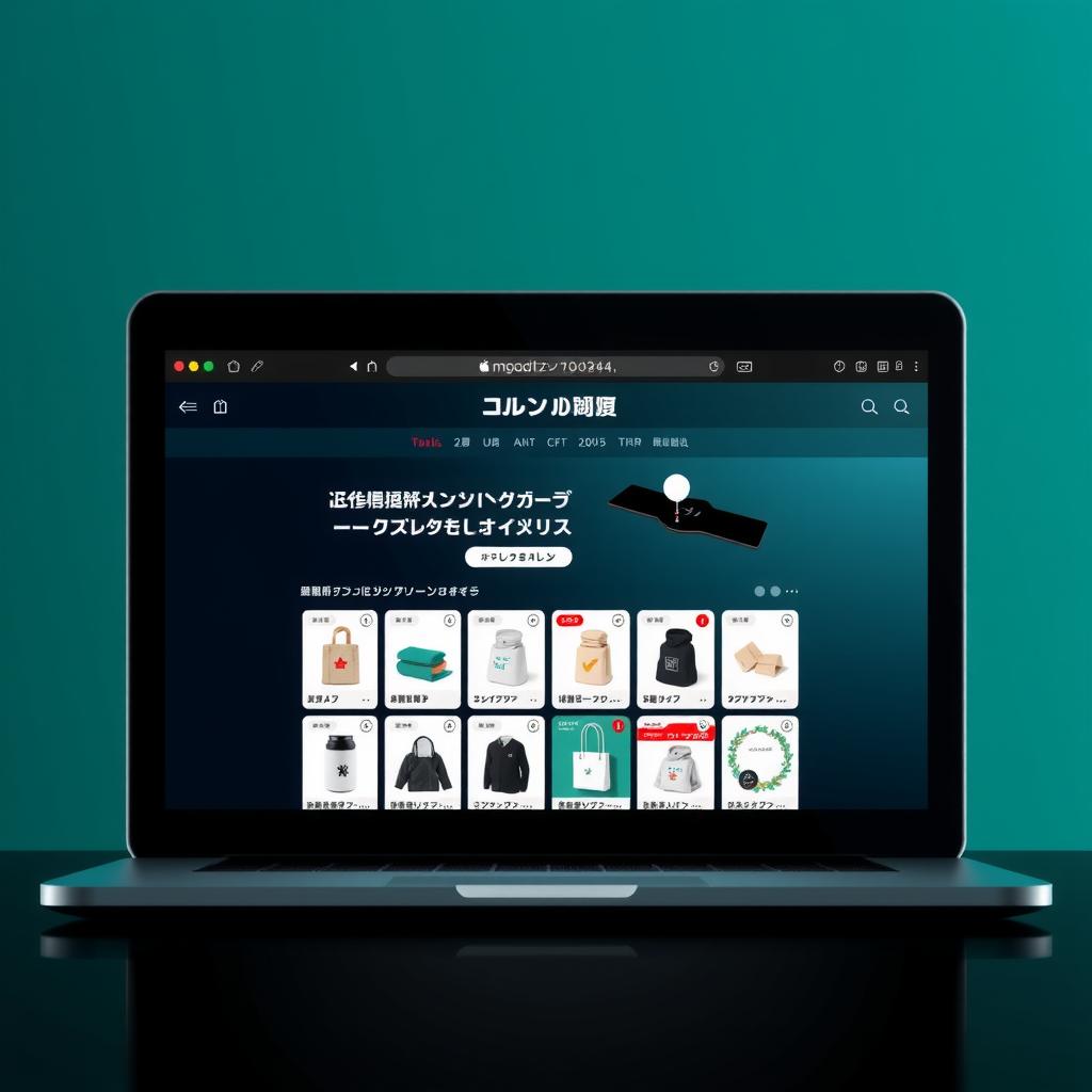
Japan
Text-dense, information-rich, smaller font sizes, lots of content above the fold
Design ConceptInformation hierarchy through density — dense layouts can be clear when supported by consistent micro-patterns (thin borders, background tints, uniform spacing)
ProsHigh information-per-viewport, clear visual hierarchy, decision-ready content without scrolling, structured data density ideal for agent analysis
ConsSmall font sizes (12-14px) fail WCAG thresholds, cognitive load for global audiences, AI training data bias toward western minimalist conventions
Target MarketEfficiency-seeking audiences — repeat shoppers, B2B buyers, power users who prioritize speed over visual exploration
Message"I respect your time. Here's everything you need. Make a decision."
Product/ServiceE-commerce marketplaces, SaaS dashboards, data-heavy directories, comparison engines, any intent-driven interface
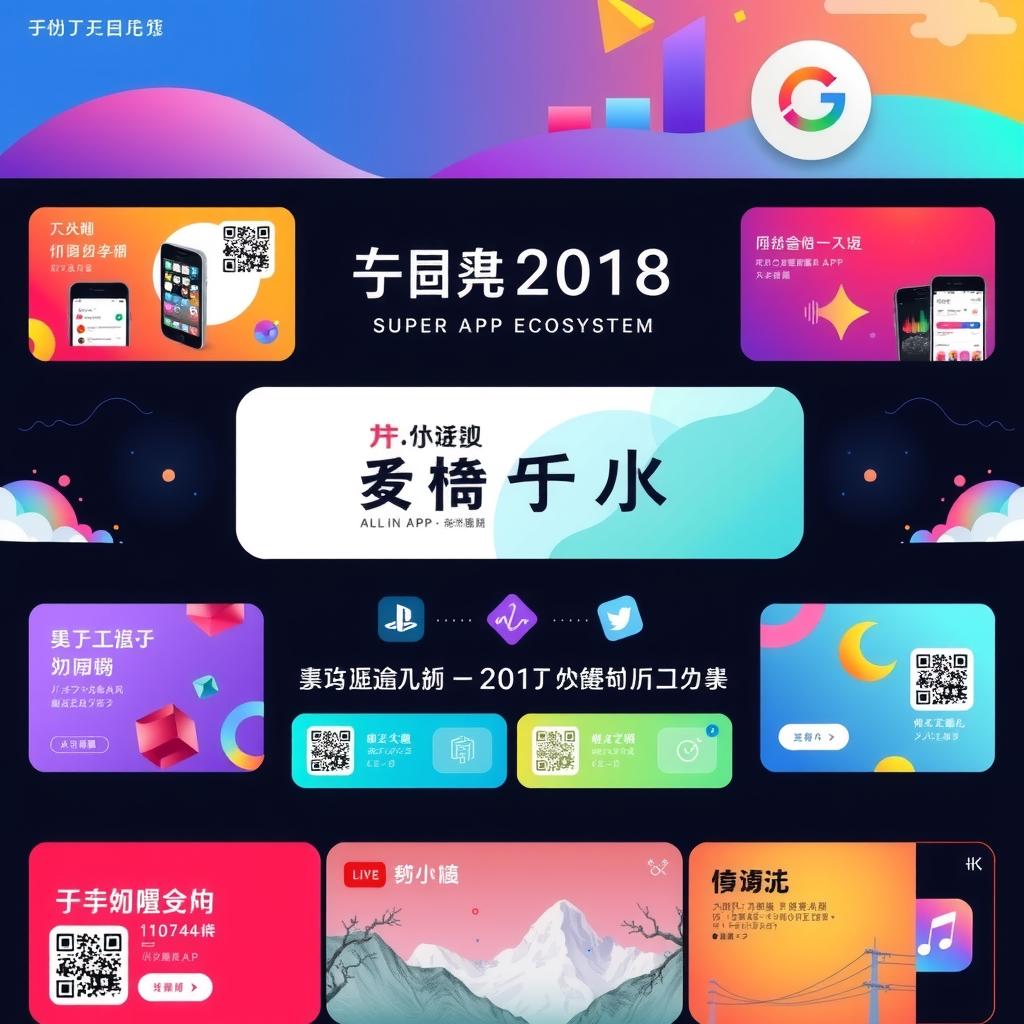
China
Busy, colorful, all-in-one page design built for mobile-first super-app ecosystems
Design ConceptAll-in-one density with intent — every tile, button, and QR code drives the user toward action. Density is a feature, not clutter
ProsEverything in reach without navigation, QR codes as design bridges to mini programs, mobile-first by default, color carries semantic meaning (red=promotion, gold=premium)
ConsCognitive load for global audiences, agent training bias against dense layouts, low contrast by western WCAG standards, deep DOM trees flag western simplicity heuristics
Target MarketMobile-first users in super-app ecosystems (WeChat, Alipay) where the page is the destination — no navigation away needed
Message"Everything you need is right here. Tap anything."
Product/ServiceE-commerce platforms, service aggregators, social commerce, travel booking, food delivery, fintech dashboards
India
Mobile-first, vibrant color, festival-driven, UPI-native — design for the next billion
MarketIndia
LayoutMobile-first by necessity (93% smartphone internet). Bento-grid cards, bottom navigation, moderate-to-high information density. Performance-optimized for low-end devices. UX4G government design system mandates responsive mobile-first.
ColorsHigh-saturation palettes — saffron (sacred), gold (wealth), parrot green (prosperity), festival red (auspicious). Color meanings invert Western norms. Festival-driven seasonal overhauls (Diwali, Holi, Eid).
TypographyMulti-script mandatory — 22 languages, 13+ scripts. Devanagari needs 1.6-1.8 line-height (headstroke clearance). Heavier font weights (500-700) for readability. Hinglish code-switching in UI copy. Noto font family standard.
UI PatternsWhatsApp-integrated support buttons. UPI-first payments (BHIM, Google Pay, PhonePe). OTP-based login. Address forms with landmark fields. Language switch as persistent UI element. Festival-themed seasonal UI.
Cultural ContextHigh Power Distance (77): hierarchical layouts, authority signals. Low Uncertainty Avoidance (40): tolerance for dense information. Collectivist (48): group/family-oriented messaging. Bharat vs India divide creates two audiences with different digital literacy.
SourceTavily research (July 2026). Cross-referenced: Hofstede Insights, India in Design, UX4G, Octet Design Labs, Statista.
Middle East (Arabic)
RTL-first, green/gold palettes, hospitality-driven UX, high-context communication
MarketMiddle East / Arabic-speaking world
LayoutFull RTL mirroring — navigation, breadcrumbs, cards, progress bars all reverse. Symmetrical, structured hierarchy preferred. Text expands 25-35% from English, requiring generous padding. CSS logical properties over physical positioning.
ColorsGreen = Islam, faith, prosperity (used for primary CTAs). Gold = luxury, prestige (Gulf opulence). Deep blue = protection from evil eye, not corporate trust. Desert-inspired terracotta/sage emerging. Seasonal Ramadan themes.
TypographyArabic cursive script: 28 letters × 4 contextual forms. Body text 17-18px minimum. Line-height 1.6-1.8 for descender clearance. Naskh for body, Kufi for display, Diwani for branding. Poor rendering is culturally offensive — script is language of Quran.
UI PatternsRight-aligned form labels. RTL tab order. Arabic-Indic digits for dates. Hamburger slides from right. Arrow icons mirrored. Local payment methods (Mada, KNET, STC Pay). WhatsApp for hospitality-driven support. Authority imagery builds trust (high Power Distance).
Cultural ContextVery high Power Distance (80): authority signals, formal language. High Uncertainty Avoidance (68): detailed guarantees, clear pricing. Collectivist (38): community/family imagery. Hospitality culture: generous free trials, 24/7 live chat, warm welcoming tone. High-context communication: implicit meaning through symbols and color.
SourceTavily research (July 2026). Cross-referenced: CloudTopia RTL Guide, Material Design Bidirectionality, Santa Media, Hofstede Arab World, NamiNouran Color Psychology.
Germany
Functional minimalism, grid precision, privacy-first UX — Bauhaus heritage meets modern Datenschutz culture
MarketGermany / DACH region
LayoutGrid-driven minimalism. Strict Swiss design principles — generous whitespace, clear visual hierarchies, logical content structures. Text expansion 25-35% from English demands flexible containers. CSS grid and logical properties standard.
ColorsRestrained and functional. Muted blues, grays, whites, black. Single accent hue against neutral surfaces. Bright colors register as unprofessional. Blue-gray-white palette signals seriousness and trust. DSGVO-mandated cookie banners are a persistent UI element.
TypographySans-serif precision — Helvetica, Univers, Inter, geometric sans-serifs. Clean, neutral, functional hierarchy. Generous letter-spacing for long compound words. Flat hierarchy where size and weight do the work.
UI PatternsPrivacy-first design. Prominent cookie consent, clear Impressum/Imprint, transparent pricing with no hidden costs. Trust through transparency. Forms are minimal and data-efficient. WhatsApp and chat are secondary — email and phone remain primary contact.
Cultural ContextLow Power Distance (35): flat hierarchies, direct communication. High Individualism (67): personal achievement messaging. High Uncertainty Avoidance (65): detailed specs, transparent pricing, technical thoroughness. Restrained (40): understated, functional design over decoration. Bauhaus/Swiss design heritage creates cultural expectation of grid-based, minimal interfaces.
SourceTavily research (July 2026). Cross-referenced: Ironhack UX Germany, Hofstede Insights, Lichtenstein.io, Swiss design principles, DSGVO guidelines.
Brazil
Vibrant, warm, socially integrated — design for emotion, community, and mobile-first engagement
MarketBrazil
LayoutRich and immersive. Bento-grid cards, carousels, full-bleed hero sections. Mobile-first with bottom navigation. Moderate-to-high information density layered with imagery, video, and animation. Performance-optimized for mid-range devices. Accessibility requirements (ASES evaluation system) gaining traction.
ColorsVibrant and celebratory. Green (Amazon, prosperity), yellow (sun, optimism, Carnival), blue (tropical waters). High-saturation combinations that read as joyful, not loud. Festival-driven seasonal overhauls (Carnival neon, Festa Junina warm tones). Color carries emotional weight — the palette signals warmth before information.
TypographyFriendly rounded sans-serifs — Nunito, Poppins, Montserrat dominate. Display fonts for headlines with playful weight contrast. Warmer than European norms: looser tracking, friendlier curves. Multi-script and accessibility-aware typography expanding under ASES law.
UI PatternsSocial-first design. WhatsApp floating buttons are the primary customer channel — often with live chat. UPI-pix instant payment integration expected. Embedded social feeds (Instagram, TikTok). Festival-themed seasonal UI overlays (Carnival, Christmas). Language switch and accessibility toggle as persistent elements. Group/family imagery outperforms solo portraits.
Cultural ContextHigh Power Distance (69): authority signals (certifications, trust seals) important for conversion. Collectivist (38): family and community imagery essential. High Uncertainty Avoidance (76): social proof via WhatsApp availability. Indulgent (59): emotional, celebratory design language. Digital culture leapfrogged desktop — mobile-first is the only mindset.
SourceTavily research (July 2026). Cross-referenced: LiveAjans Brazil Design, Hofstede Insights, Springer HCI Brazil study, iTechfy Brazil Web Dev, ASES accessibility standards.
Researched via Tavily. Markets rotate weekly. Hero images generated via FLUX.1-schnell.