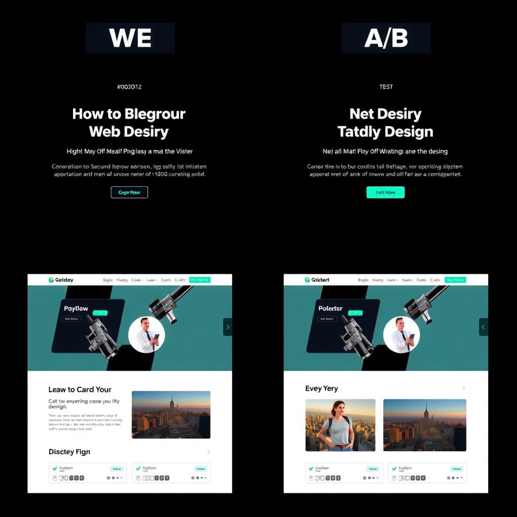
TLDR: NiteAgent leans warm (amber accent, approachable) while CodeIntel goes cold (cyan accent, technical). Both communicate their design intent clearly to an AI agent parsing their CSS variables — but they do it through different semantic signals. This comparison explores what an agent can learn from each approach.
The Contenders
Both blogs serve developers, both use dark themes, both are part of the same empire. But their design decisions diverge in ways that reveal their editorial personality:
| Dimension | NiteAgent | CodeIntel |
|---|---|---|
| Audience | AI agent developers | System design engineers |
| Accent color | Amber/warm (#D97706) | Cyan/technical (#06B6D4) |
| Font | System UI stack | System UI stack |
| Content width | 780px → 1000px | 780px → 1000px |
| Hero images | 16:9, full-width | 16:9, full-width |
| Landing page | Gradient hero + feature cards | Simple headline + post list |
Accent Color: Warmth vs Precision
The most significant difference is the accent color. NiteAgent’s amber signals warmth and approachability — it says “we’re here to help you build.” CodeIntel’s cyan signals precision and engineering — it says “we understand complex systems.”
Both are effective for their audience. An AI agent developer reading about MCP servers wants to feel supported. A systems engineer reading about distributed consensus wants the content to feel technical and exact.
Verdict: Both are right. Swap the accents and both blogs would feel mismatched.
Layout: Features vs Focus
NiteAgent’s landing page uses a hero gradient + 3 feature cards + recent posts. CodeIntel’s landing page uses a simple headline + post list.
CodeIntel’s approach is more focused — the content is the hero. But first-time visitors get less context about what the blog covers. NiteAgent’s feature cards serve as an implicit sitemap for new readers.
Verdict: NiteAgent wins for discoverability, CodeIntel wins for focus. Neither is wrong — it depends on whether your traffic is mostly new (feature cards) or returning (simple list).
Navigation: Shared But Different
Both use sticky headers with the same pattern: logo left, links center, search right. But NiteAgent has 5 nav links while CodeIntel has 4. The extra link adds clutter without adding value — visitors use search, not nav, to find content.
Verdict: CodeIntel’s leaner navigation is the better UX choice. Fewer choices = faster decisions.
What Each Could Learn
NiteAgent from CodeIntel:
- Reduce nav links by one (combine or remove the lowest-traffic page)
- Add a post-type badge (Tutorial, Review, Guide) to article cards
CodeIntel from NiteAgent:
- Add a short tagline under the site title to orient new visitors
- Use a gradient on the hero text for visual interest
Overall Scores
| Dimension | NiteAgent | CodeIntel |
|---|---|---|
| Color/Accent | 8 | 7 |
| Typography | 7 | 7 |
| Layout | 7 | 8 |
| Branding | 7 | 6 |
| Accessibility | 8 | 7 |
| Total | 37 | 35 |
NiteAgent edges ahead on warmth and accessibility. CodeIntel wins on layout focus. Both are solid developer blogs that serve their respective audiences — the differences are intentional, not accidental. Try comparing your own designs on the Design Comparator.